Milan Design Week Review: Designers or Party Planners?
It has been two weeks since my first Milan Design Week as a young product and furniture designer. During an intense week of design exhibitions, I visited Fuorisalone, which is all around Milan, Salone del Mobile and Alcova. With over 20,000 steps a day, packed crowds, and 2-hour queues: I managed to see as much as possible of the design world that condenses into this whirlwind week once a year. Milan Design Week displays designs from young emerging designers to the major industrial brands, and it was amazing to see similar themes emerging throughout the city. What are designers saying for this year? Well interestingly the main trends ranged from using more materials like metal and paper, to unique themes of food and cigarettes. Furniture was also being embellished with jewellery, and curated vintage Milanese apartments were a popular feature of this design week. Let’s break down these trends and other unique ones that caught my eye during Milan Design Week.
Firstly, let’s start with the most eye-catching and mouth-watering theme of this Milan Design Week: food!
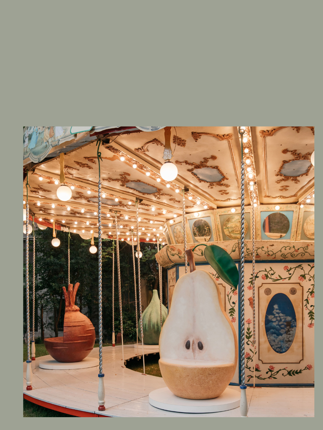
At Salone Del Mobile, Bull & Stein showcased a collection of apple furniture by Paulo Terra. This brand uses fruit to create sculptures and seating and this year they showcased the “Pomme chair and pet home”: a large, colourful, shiny apple that supports and wraps around you, or your pet, while you sit at home. Fruit featured again at Arket x Laila Gohar at Fuorisalone. Laila Gohar is the artist and creator of Gohar World, which produces elegant dinnerware products, and she curates food and tableware designs for art exhibitions internationally. In Milan at the Giardino delle Arti, she reimagined the carousel as a food fantasy: where each carriage is a different type of oversized fruit or vegetable. All these large, oversized fruit seats are playful, colourful and surrealist. This matches current design trends like fruit and vegetable bag charms, or bags from Loewe and Dior which feel playful and refreshing in the luxury space. Design is using natural forms to accessorize our bags, and now our interior spaces.
Besides vegetables and fruit, carbohydrates are another food group featured in design week. Studio Co-Pain from the Design Academy Eindhoven section at Alcova, showcased the T65 “Croûte que Croûte” lamps and seats made from bread! The studio blends the traditional craftsmanship of breadmaking and the craftsmanship of furniture making, redefining the function of bread in a dining room. It’s a clever, sustainable and beautiful way of crafting furniture, and the ornamentation on the pieces make it look like ceramic. It makes you do a double take.
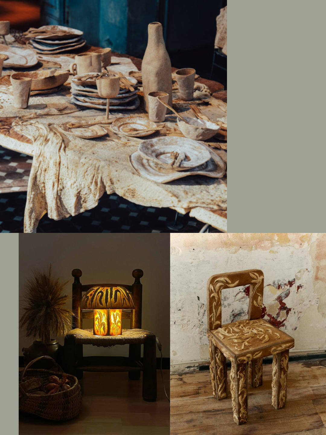
At Alcova, the baking theme continued with a “Feast for Rats” bread dining table, with a bread tablecloth, bread chairs and an entire bread dinner ensemble of cutlery, cups and decor made by designers from Geneva University of Art and Design. Their project explored the relationship of animals in interior spaces, and the detail of the bread designs convinced me it was a ceramic dinner layout. Turning to bread as a material isn’t surprising, as it is part of the trend of discovering biodegradable and sustainable ways of creating products. Biomaterials are so important to explore in an age where plastic is taking over landfills, and our own bodies. Bread is just flour and water: it’s biodegradable, sustainable — it is accessible and cheap. In a time of economic unrest this bread furniture might have all the answers. It is a genius way of repurposing basic materials and simultaneously highlighting the historic craft of baking.
The next trend I noticed brings us back to the 90s: furniture designed for smoking and drinking.
I understand the world is chaotic these days, so I am not surprised design is signalling us to have a break, but 90s trends are coming back again.
Jeans are getting skinnier, Carloyn Bessette Kennedy style is on everybody’s Pinterest board, and cigarettes are back. I understand that cigarettes never really left, but it’s the way people are smoking, and where, with a vintage ash tray on an aesthetic sofa, that is the design post circling on social media today.
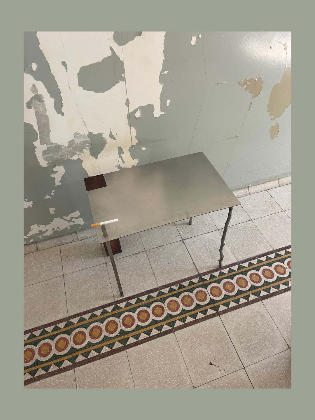
At Alcova, Louis Barret and Ashley Law designed the Detrius 01 side table for Flawk Gallery, which is a beautiful metal and wood side table with a small quirk: a small cigarette stand to hold your cigarette for you. It is unique, elegant and functional if you need to smoke.
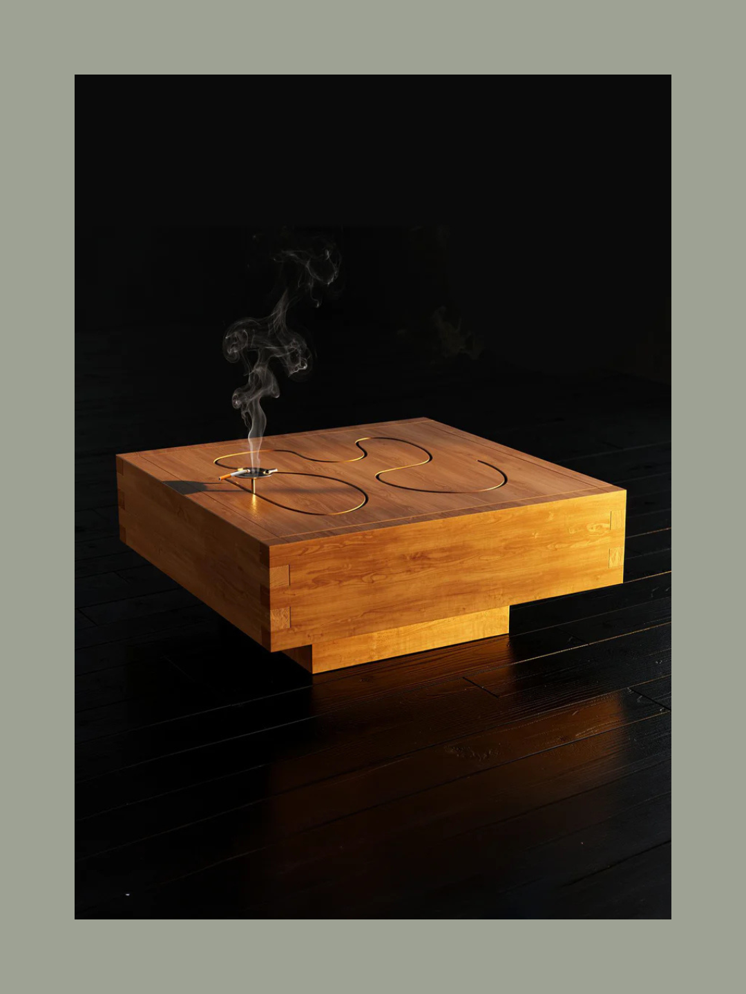
At Bisa Studio at Alcova, the theme of indulgence continued with a wood mirror that has a small stand for your wine glass. I believe this niche affordance is so clever: if you are at a social gathering and you can let the mirror hold your glass while you check how you look, it’s one less thing to worry about. Bisa Studio also created the “the Social Smoker” a wooden table which has a built-in metal ash tray that circulates around the table so you can push or pull the ash tray to anyone around the table. Bisa studio encourages social interaction with their furniture, which is part of the larger trend of social furniture like conversation pits. It is a wonderful feature to promote in an age where people are separated by technology. Both design studios are making smoking look aesthetic and feel comfortable for users – this goes back further than the 90s, it’s like a classic 1960s smoking advert.
Milan is a fashion capital and displaying your personal style is encouraged in a city of fashion enthusiasts. This year at design week, furniture was accessorized, it was wearing jewellery.
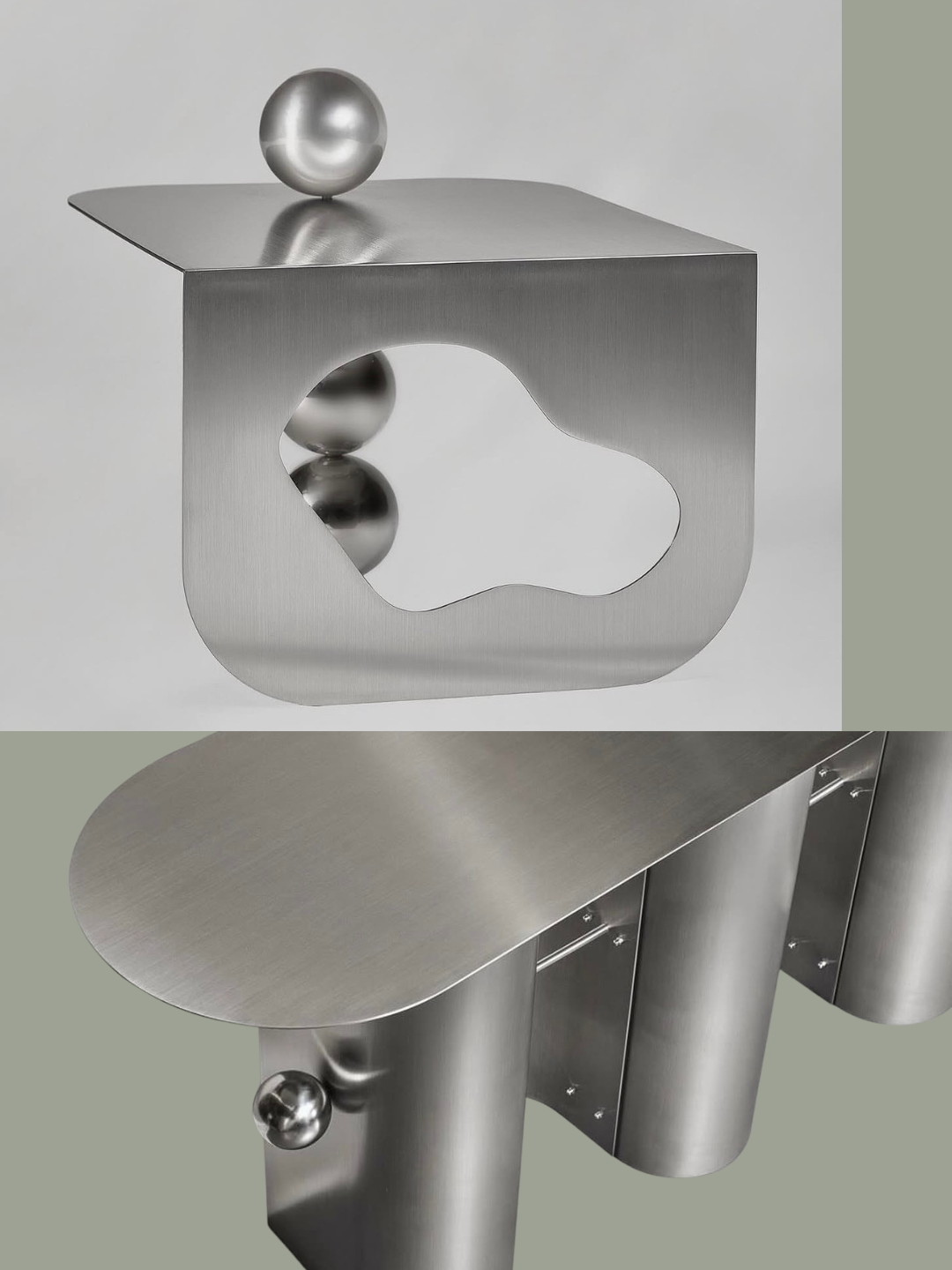
“Salone Satellite” showcases young emerging designers at the Salone Del Mobile, which feels so refreshing in a space filled with highly industrial conglomerate companies. Manu Pagliosa is a Brazilian furniture designer that showcased “Body in Tension” at Salone Del Mobile, where her furniture designs have piercings. Her collection of metal and glass tables have protruding spherical piercings that stretch through each design. It is such an interesting approach to bring human adornment into furniture and although piercings can be perceived as punk, her designs have a geometric elegance. In contrast, CJ Aslan really brought punk to furniture at Alcova. Her “Designed Objects” series, feature “147 hours of hand set assorted spikes and gemstones” on a stainless-steel seat and ottoman. She is the artist behind “Aslan World”, which recently released studded and spiky “teeth” ballet flats. The base of her seat is a cube, inspired by the feeling of empty digital spaces. Surrounding the cube are spikes and stones, giving the seat it’s character — it is a rockstar seat — originally inspired by trees that grew thorns to defend themselves. Her designs are a fantasy, and it was a pleasure to interact with her chair: I felt like a rockstar too.
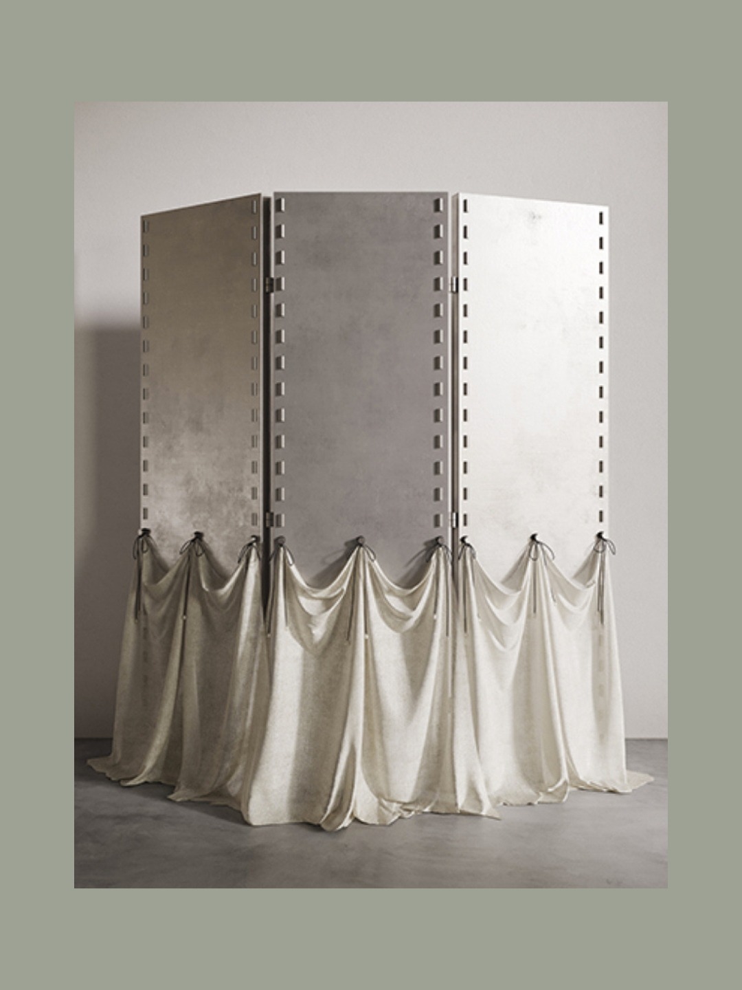
Also, at Alcova, there was more embellished furniture by Llewellyn Chupin which were less punk, but more ritualistic. Her designs completely blew me away; they are sublime. Her “Rituals of Adornment” series featured a bench, a chair, a screen and standing lights made from a soft patinated aluminium. Each object had a touch of adornment: a silk train or a natural pearl chain dropped softly from the pieces. A fragile contrast to the metal structure. The designs represent the soft presence of the sacred, which is the exact sentiment I felt around the objects. It felt like a meditative space. These designs display the power of how accessories can transmit different aesthetics, which we see everyday in how people wear jewellery.
From punk to the sacred, that range exists in every art medium and it is beautiful and fun to see it emerging in furniture design.
Curated Apartments
A trend from the city of Milan itself were refurbished Milanese apartments. They are highly curated furniture and art displays in traditional and historical Milan apartments. There were more queues for these apartments in Milan, than the bars or nightclubs, which is how design shifts the city during this week. One of the most anticipated apartments on display was an apartment in the Palazzo Olivazzi, 21 Via Bigli, designed by Osvaldo Borsani which was once the home of Albert Einstein. The design was curated by Interni Venosta and it was a perfect mixture of modern design elements with the classic historical interior of the apartment. The living room featured built-in nooks around the ornate wooden fireplace, which was a clever design for a private library space. The colour palette was classic, the furniture was black, white, grey or brown which nested perfectly with the original wooden floors and stained-glass windows.
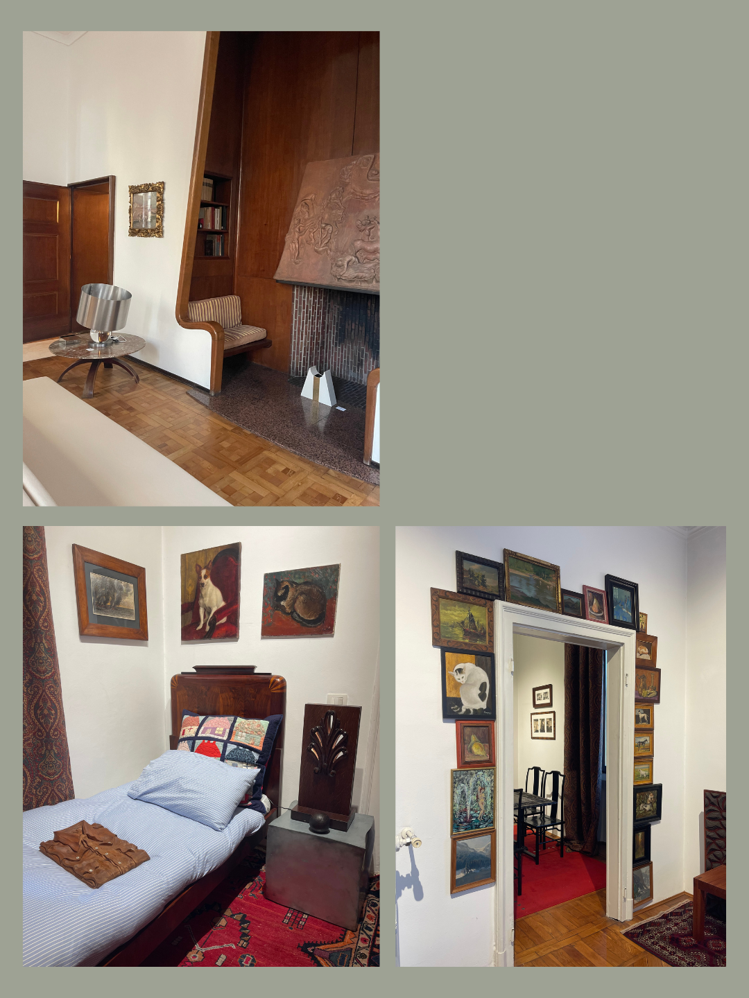
The second apartment I visited was “l’appartement” curated by Antoine Billore and L’artisan Parfumeur, on 2 Via Giovanni Lulli. Before you enter the home, you can smell it from a block away, the artisan parfumeur candles smelt so tantalising that it guided you to the apartment. Antoine Billore collects wonderful antique pieces of art and design from fairs, and even flea markets for interiors. This apartment was beautiful, every detail was considered in the curation, it was filled with gorgeous small designs in every corner of the space. From the exterior garden to the bathroom and even a small chess room, there were intricate design pieces that were perfect for each room. One of my favourite pieces was the wooden clothing in the bedroom to create the feeling of the space being lived in. The apartment was lined with antique art and beautiful wooden picture frames that were carved and ornamental. Even a door frame was lined with small paintings, it was delightful. I felt like I was in a doll house where I wanted to check every small corner, because there would be a gorgeous small design or sculpture waiting to be seen.
In a time of minimalism, this maximalist space felt like a refresh, where even small design objects were celebrated instead of being tucked away in a closet. Milan was filled with these gorgeous, curated apartments — a home environment is central to our own lives, so it gives the audience a personal and comforting experience of design, compared to a gallery show.
A wider trend I noticed throughout Milan Design Week is the use of metal and paper as materials. There were so many metal objects and furniture pieces that it’s not even possible for me to list specific examples, because it was featured in every booth or display.
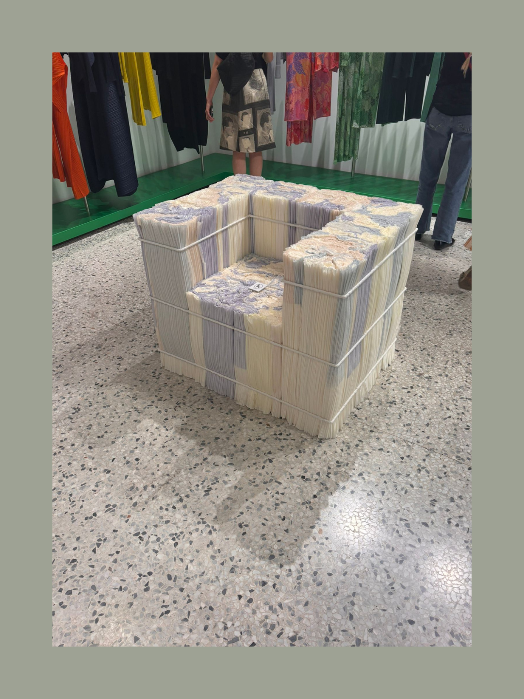
Using paper in light fixtures and products is also one of the biggest trends this year. One memorable example was at Issey Miyake’s furniture display which was all made from compact and folded paper. This is very on brand for Issey Miyake, as the fashion house explores the possibilities of folding for clothing, however they took that principle into furniture. They took folded wastepaper and densely packed it together to create blocks which became tables, side tables, chairs and an armchair. The colourful paper created a beautiful, marbled effect on the final objects, and they were sturdy and strong. As a designer-maker who works with metal primarily, I was excited to see how it was being shaped and developed into new designs, but I also understand why designers are using it more alongside paper. Fundamentally, paper and metal are more accessible materials, as wood is becoming increasingly more expensive. They are also easily recyclable. In an age where designers must be sustainable, metal can be recycled endlessly, and paper is a biomaterial that can be reduced to pulp and reused again.
Economically and environmentally metal and paper are obvious choices for design, and it was clear during this design week.
Finally, a trend that has been around for a while, is the social furniture of the 1970s. The conversation pits and the wide communal sofas which encourage you to socialize with others. At Alcova the “Seat in Touch” by Supaform reimagines public seating as a communal and modular sofa system, with speakers and a record player. It is an elevated conversation pit that accommodated design talks throughout the week, and the design created the perfect environment for social gatherings.
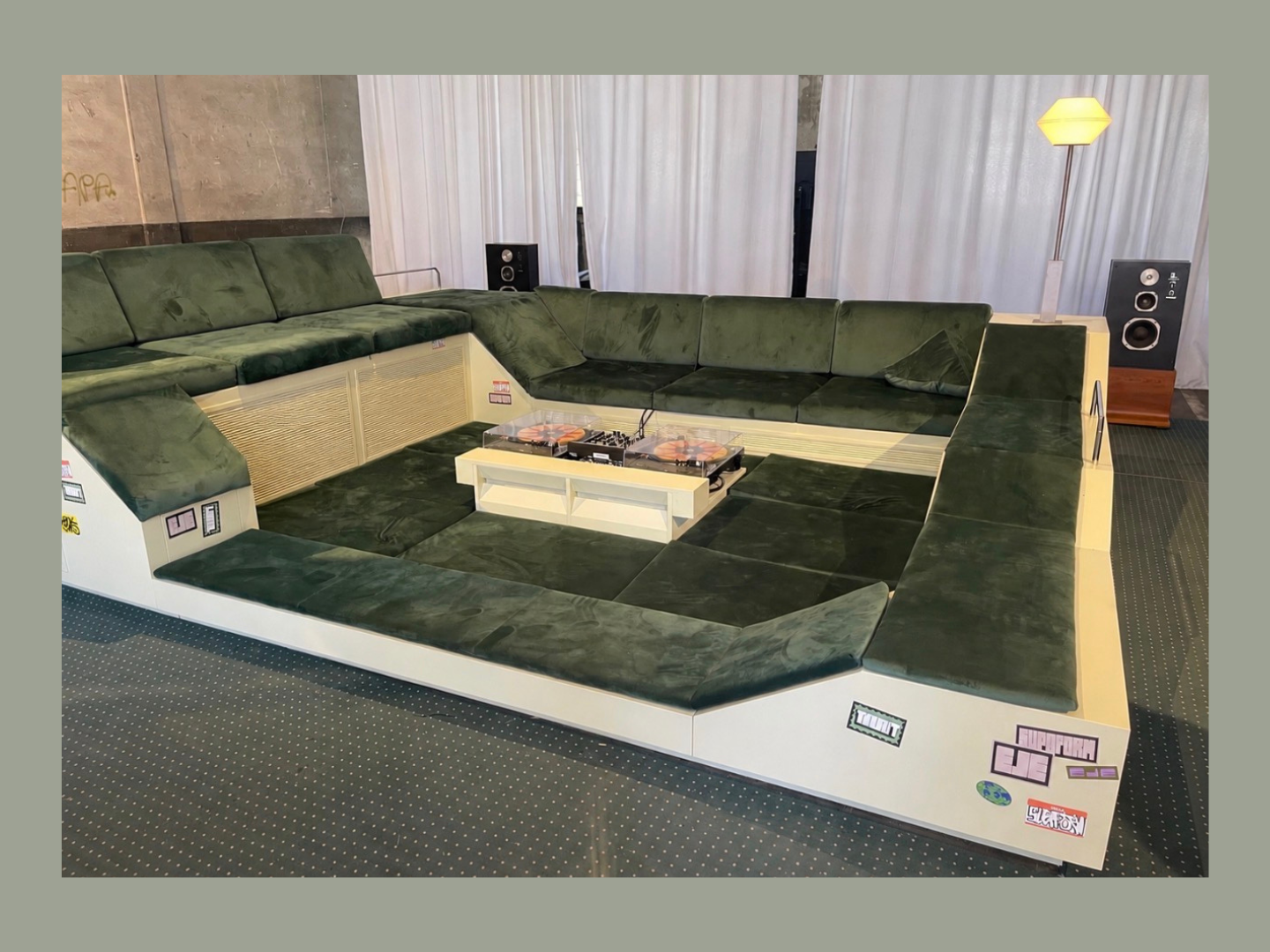
At the Salone del Mobile, wide and modular seating was featured in most booths as it is comfortable, and it allows for multiple people to interact in one place. It is ideal for hotel lobbies and communal indoor spaces. Conversation pits and modular seats are interactive and playful; they physically create a space in which you must face other people. It’s a great way to get people off their phones and focused on a conversation, all through the power of design.
The 1970s space age aesthetic has been trending for a while now, but the message it shares through design is a simple one: to socialize and talk to each other, whether at home or in an office. I think it’s the best message for our generation.
Milan Design Week is an incredible experience that every young designer should try to go to. It introduces you to new ideas in your design work: you understand new materials, new joining methods, new ways of design thinking and so much more. Design week is also relevant for anyone who is interested in interiors, or arts and culture, as it also gives you a perspective on the cultural values of our time. This article has been my perspective and opinion on the most fun and unique trends that I found throughout design week. Every designer will notice different things that stand out to them, but overall, I believe the theme of this year was indulgence and how we can express that in our spaces. Food, cigarettes, jewellery and social gathering are all features of a party.
So perhaps that is the design message of this year: choose accessible, sustainable materials and throw a party.